Selected Works
I've worked at the intersection of journalism and technology for a decade. In that time, I've built a lot of stuff. I'm still proud of some of it! This is a selection of some of my favorite projects.
Nearly every project I've ever worked on has been a team effort. I love collaborating with people who make me better. Every project in this portfolio is a result of collaboration with amazing people.
Washington Post 2022 Election Results
November 2022
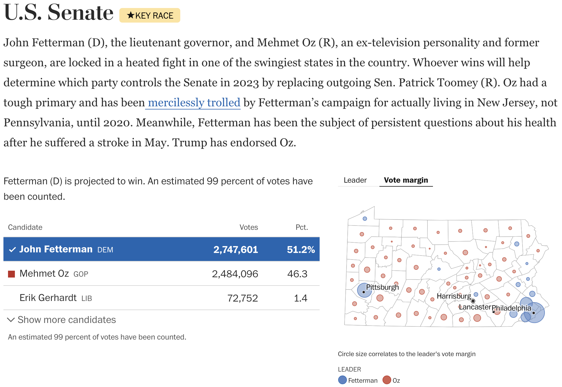
I rewrote the frontend application for the 2022 election results system at The Washington Post using TypeScript, next.js, Zustand, and Vercel as a deployment platform. Vercel interviewed me about the process after the election as a success story. While engineering this work, I successfully argued for the team to use bubble maps rather than choropleth maps as a more accurate data presentation for election results.

Tiny News Platform
2020-2022
As a co-founder of the Tiny News Collective, I architected the Tiny News Platform, a complete publishing system built for small publishers. The Tiny News Platform innovates in a number of ways: it is a completely serverless publishing system using Google Docs as the text editor. It integrates directly with the Letterhead newsletter platform and the MonkeyPod donation platform. And the front-end runs faster than most other local news websites you'll find on the internet.

Table Stakes Challenge Tracker
2019-2020
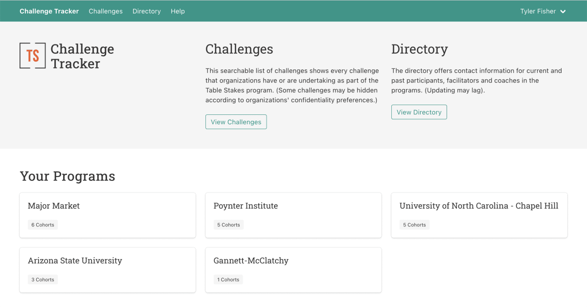
In collaboration with the American Press Institute, I architected and built a performance challenge tracking system for the Table Stakes Local News Transformation Program. The Table Stakes program puts news organizations through a rigorous methodology called Performance Driven Change, where teams undertake performance challenges in order to solve critical problems at their organizations. The Challenge Tracker allows the Table Stakes program to track the many performance challenges happening across the Table Stakes universe.

Politico Election Results
November 2018
As a member of the Politico Interactive News Team, I architected our 2018 election results loader. Using AP election results, we optimized the loading process to get results to our users as fast as possible, processing the entire nation's results set in seconds. This results system powered pages for national overviews as well as state-specific pages. While getting results to our pages as fast as possible, the system also reconciled results into a Postgres database, where they could be joined with demographic data allowing us to perform a deeper analysis of results in real-time.

DIY Congress
October 2018
Prior to the 2018 election, we wanted our audience to predict their own outcomes of the election with the most information we could give them. DIY Congress offers a way to predict races not only on a race-by-race level but also on a demographic level. For example, you could see the results of the election if all highly educated districts that voted for Hillary Clinton in 2016 elected Democrats. Technically, this work required significant performance optimization in React and creative CSS layouts to build a smooth experience.

Politico 2018 Race Ratings
Summer 2018
At Politico, we had a stable of election experts reporting on all the major races in the country. We launched Politico's first-ever race ratings system in order to make use of our in-house expertise. I built a custom Django-backed application allowing our editors to change race ratings and track changes to the ratings over time. Then, I created a slimmed-down dataset for use in our front-end application for users.

Rain Forest Was Here
November 2015
On the NPR Visuals Team, I worked on a visual storytelling project called Look at This. We specialized in telling sequential visual stories that made people care. Rain Forest Was Here was the final Look at This project, an encapsulation of everything we learned on the project. I built the front-end application and reported on the history of both Brazilian and US deforestation projects.

How Well Can You Hear Audio Quality?
June 2015
On the heels of high-fidelity streaming becoming widely available, I created a short quiz with a simple premise: can you really hear the difference between low-quality and high-quality audio files? The quiz gives you three files playing the same snippet of a song: one at 128kbps, one at 320kbps, and one as an uncompressed WAV. Your job is to guess which one is the uncompressed WAV.
This quiz was NPR's most successful digital content ever until the 2016 election. It proves a theory I have about internet quizzes: the most successful quizzes either prove to you how hard something is (like this quiz) or teach you something about yourself (like, say, the NYT dialect quiz). Spoiler: you probably can't hear the difference.

A Photo I Love Featuring Astronaut Reid Wiseman
March 2015
On the Look at This project, we typically told two forms of sequential visual story. The most common was user-driven: users could determine when they moved to the next piece of content. But sometimes, we built audio-driven sequential visual stories. These play like web-native videos, where the audio file plays, and code triggers at different timecodes in the audio file to display new images, or, in this case, make new tweets bounce around the screen. This playful story about an astronaut taking photos of Earth was a perfect fit for the format.

SoundCite
2012
It's hard to believe I built SoundCite as a student a decade ago. I had a simple idea: what if, when writing about music, you could just embed the snippet of music you're talking about with your text, instead of painstakingly trying to describe it in words. Even today, the SoundCite format is used for just that format, like in this New York Times piece on guitar solos.
